
Packaging Design – BrilliArt
Brief
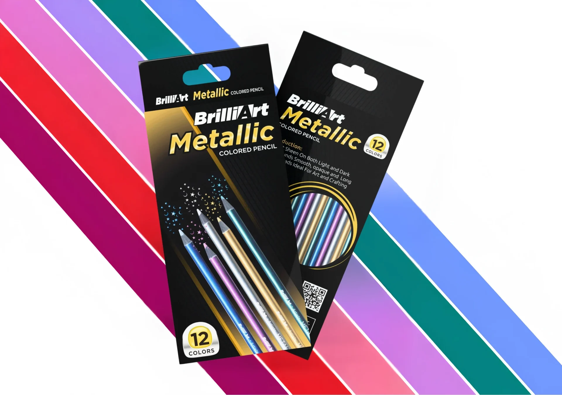
Be Creative is an international art supplies brand with two product lines. BrilliArt is their premium art-supplies range, featuring metallic-coloured pencils designed for artists and crafters who demand quality, finish, and shelf presence. Art supplies packaging has to work hard in two directions simultaneously. It has to appeal to the creative buyer in a retail store and communicate product quality clearly to an online buyer viewing a thumbnail.
The brief was packaging design only. No print, no photography. Pure design execution for an international client.
Our Approach
We built the BrilliArt packaging around the product’s premium metallic positioning. Black became the base, dark, premium, and the perfect canvas to let the metallic pencil colours pop. Rainbow diagonal stripes gave the pack energy and creativity without compromising the premium feel. The metallic pencils were shown spilling out of the pack, immediately communicating the product inside.
Typography was bold and confident. BrilliArt Metallic front and centre, colour count, and product description supporting without cluttering. The design was built to work at full retail size and reduced to a thumbnail for e-commerce.
The Result
BrilliArt had packaging that competed with the best in the international art supplies category. Premium, distinctive, and immediately communicating quality. A design built to perform on shelf and on screen.