
Packaging Design – Herbolina
Brief
Herbolina is a health-focused brand built for people who treat nutrition as a foundation for a better life. The product , quality oats, was strong. The packaging was not. The breakfast aisle is one of the most cluttered shelves in retail, and Herbolina needed to stand apart without shouting.
The brief was clear. Move away from the heavy, corporate aesthetic of the category. Build something that feels modern, clean, and approachable, premium enough to command attention, accessible enough to earn trust at first glance. So we built the visual system from the ground up.
Our Approach
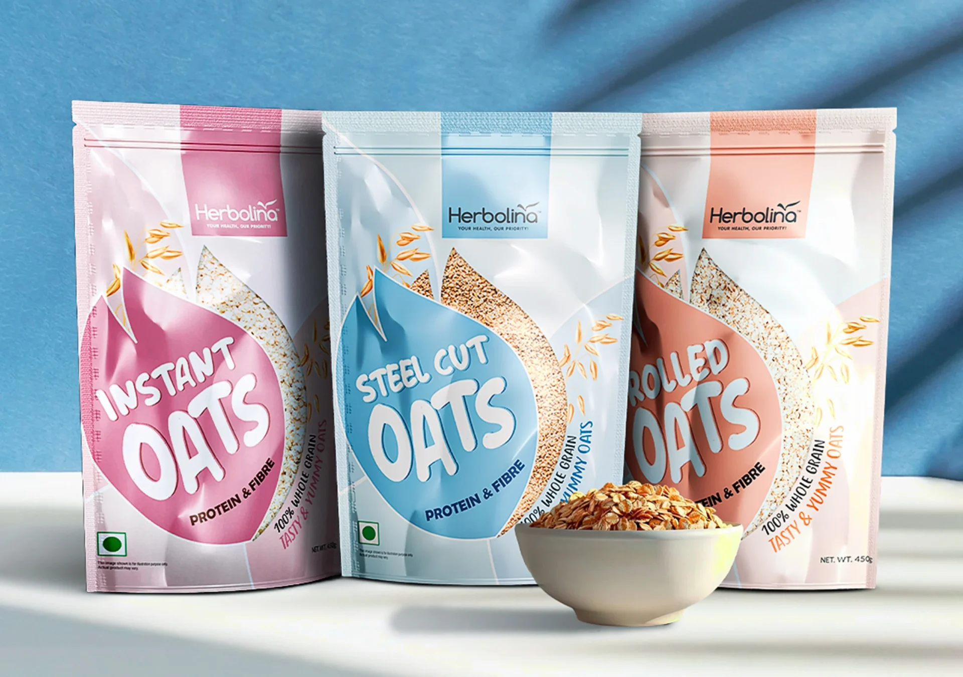
We anchored the design in soft pastel tones and bold, friendly typography, a combination that communicates health without looking clinical. Colour does the heavy lifting on a retail shelf. We chose a palette that reads warm and trustworthy from three metres away.
The teardrop-shaped window was a deliberate structural decision. Transparency communicates honesty. Showing the oats directly builds more trust than any ingredient callout. The window shape became Herbolina’s first brand signature, the one detail customers recognise and remember.
The Result
Herbolina launched with a packaging identity that stood apart from every legacy brand in the breakfast aisle. The teardrop window became a recognised brand signature. Premium shelf presence, accessible price point, zero compromise on either.
A pantry staple turned into a lifestyle choice.